
The third game in the highly successful survival horror series, Silent Hill 3 is a direct sequel to Silent Hill and features a new protagonist, Heather Mason. Being thrown into a nightmare straight from the start Heather begins to learn of her eerie past and come to terms with who she really is.
What are some of Silent Hill’s greatest factors is it’s art style, dark tone and story, the ability to touch on taboo subjects and the amazing atmosphere it gives and brings the player into the nightmare world instead of just the protagonist. Personal problems and very real subjects are bought up and tackled head on. Representations and interpretations are everywhere.
In this article I will be covering the different box arts that were released in Europe, North America and Asia.
To keep it simple I will not be covering special editions and keeping only to the original releases nor touch on the HD collection.

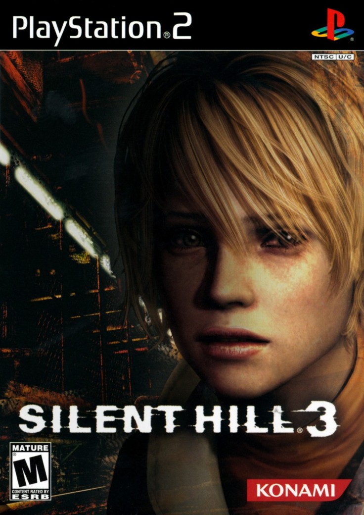
This is the European cover for Silent Hill 3.
As we can see it features the protagonist Heather Mason staring at the viewer with a haunting look on her face that is heavily distorted through the use of shadows, low contrast colors and a unique look of a faded, old photograph. Instantly the game is conveyed as being horror and full of fear.
The cover begins to tell us a lot about the story already.
The look of the photographic filter gives us the impression that it is old and worn away, a memento of the past that has been kept for a very long time. And that is exactly what Heather Mason is unknowingly, a memento of the past from when she was reborn as Cheryl. The cult from years ago return and try to make her give birth to a new god and this causes her to regain her memories and accept who she is and who she was.
The worn look makes it seem as though it’s been hidden away somewhere and left to rot which is what Harry Mason did to try and protect her, took her away from the cult and gave her a new life as Heather, his adoptive daughter.
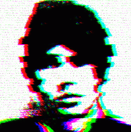
Secrets hidden behind this cover story is also shown in the cover by having the shadows darken one of Heather’s eyes so that it almost looks missing representing that half of her life was lost to her, blind to the truth.
You could also say that the shadowing on her skin makes it look like it is rotting, wasting away and burned similar to the wounds and scarring that Alessa suffered from.
The text font for Silent Hill 3 is exclusive to this game, as well as it’s American and Asian counterparts, and does not share it with the other two games that came before it. As Silent Hill 2’s font seemed to be connected by web like strings it represented connections and the feeling of trapping something, 3 feels quite different from that. This box in particular has all the letters single and on their own as if to be separating them much like how Heather is splitting and accepting that she is both the reincarnation of Alessa Gillespie and Cheryl Mason.
The blurred effect seems to represent time and shows that it is always flowing forward and is only a matter of time before everything starts to catch up with her showing you cannot outrun your fate which goes well with the overall eeriness of the box.
This is the North American cover for Silent Hill 3.
I find this one, along with many other covers of N. American origin, to be fairly bland and pretty plain with nothing terribly exciting or enticing.
Instantly we see the protagonist Heather looking slightly worried into the camera, standing in a room that is very reminiscent of various places in the nightmare world indicated by the metallic structures, fences and rusted textures.
To give it it’s unique credit this one still has a meaning behind it and it is the feeling of entrapment which all guests of the Silent Hill town feel upon entering. The rustic chain link fences are very similar to ones you find in prison and immediately gives the feeling of being caught and not able to escape which is what it is like to Heather who must face the reality of who she really is underneath her unknowing facade.
As with a lot of the Silent Hill games the colours of dark red, orange and shades of brown mixed with limiting darkness do a good job of representing hell and nightmare like places as shown in the game.
The long row of light boxes attached to the ceiling shows that there is a path to follow. Will it lead to the escape of the town or something different entirely? It’s something she must go through and this young woman is determined to do so to avenge her father who was killed at the hands of the cult leader.
I feel thought as if the box is quite unbalanced in it’s proportion of how Heather is placed upon in having her take up the entire right and half of the left screen, only leaving a small amount of the left hand side to show anything else which just happens to be where she is. As with the problem of the Europeans Downpour box it just feels rushed and done at the last minute. It doesn’t look like they even bothered to put any shading or filters over Heather to make it look like she is in the room she is supposedly standing which again just makes it seem entirely out of place.
I can’t say I see much meaning or representations in this box art apart from Heather being trapped in Silent Hill as not much has been done.
The font is again unique to Silent Hill 3 and to it’s American cover as, while being similar to the European and Asian boxes, it has it’s own specialized look. The letters are spaced out in single file and seem to have protruding spikes of distortion coming from them as if to show that something is not right. Something is definitely wrong.

This is the Asian cover of Silent Hill 3.
What’s good about the covers of the third game is that they are all visually different and have something each to offer but all have one thing in common. Heather Mason is always shown on the front which is good. Comparing it to Silent Hill 2 James was not featured on any of the main covers with other supporting characters used instead.
The European cover represents fear, the American represents determination and the Asian is the courage to fight even when facing your nightmares.
The Asian cover is the only one to show any kind of weapons or violence by having Heather hold her trusty handgun which she receives at the start of the game. From here the game shows that the young woman is in danger, scared and alone which is a perfect advertisement for a survival horror game.
Looking closely behind Heather against the tiled walls we can see various kinds of objects. One notably seems to be the well known icon of the Silent Hill series, Halo of the Sun, used as a save point in 3. Another could also be Valtiel, a demonic looking angel of the Order. This is what it must be like in Heather’s head as her memories begin to return. She knows that things around her seem familiar but she just can’t place them only seeing vivid images and blurry pictures. Fighting hard to remember where all this dejavu originates from.
The colours again scream that she is trapped in a hell like places from the uses of dark browns, oranges and rustic color, the darkness showing she is in a forgotten place and the unknown is everywhere. Even the tiles on the wall show that the place is dirty and disgusting from having what looks like mold or dirty growing or smeared against it.
The tiled walls shows what kind of place she is in which is likely the Brookhaven Hospital where is goes to after entering Silent Hill in a search for answers. Showing this place on the cover is important as not only does it represent a large fear that people have of hospital settings which are perfect places for horror games but gives a small hint on her identity as part of Alessa as she spent seven years of her life hidden inside a hospitals basement.
The font for this cover is very similar to the American version but instead opts to get rid of the blurriness surrounding it and making the edges bold with no kind of texture to the dark red outline or fill, just having plain white. To me it looks as though an old VHS tape has been put on pause and the picture has become distorted, violently being dragged left and right.
I don’t find the number three in the corner all that necessary and it does become a little bit of an eyesore seeing how nicely detailed and colourful the box already is. Having a large, plain what character take up the whole bottom right corner makes it look kind of cheap, like they were really emphasizing that they made a third game. The three itself doesn’t seem to look right either. I understand it would look strange to have just a plain number three in a basic font but the way they designed it looks really odd. Maybe it’s just me.
It may have looked alright if they hadn’t made the text in the middle read “Silent Hill 3” already. Now it sort of looks like it reads “Silent Hill 3 3”.
“I guess it’s time to roll the credits.” – Heather Mason

Leave a comment